Chris Weber provides you with a generic method to control the data for pie charts that are actually readable.
I got a call from a client last month whose in-house Access programmer had created a multi-page report chock-full of pie charts created in Microsoft Graph. The concept behind the report was to give their customers a quick visual summary of the day-to-day services being provided by my client: page after page of pie charts and accompanying tables that told the whole picture. Now, pie charts can be a very useful tool for the visual display of data… or not. When properly designed and presented, a pie chart can quickly summarize what’s happening in the data. But poorly designed pie charts, like any poorly designed display, merely cloud the issue.
One thing that I did admire about the design was the use of data labels in the display. It’s aggravating to have to refer to a legend when reading graphical displays. Whenever possible, you should always keep the viewer’s eye on the information being presented. With pie charts, this can be achieved by directly labeling the slices with data labels. Data labels may also be a necessary cueing device when colorblind viewers use your charts (see the “Data Labels” sidebar for information about how to format your data labels).
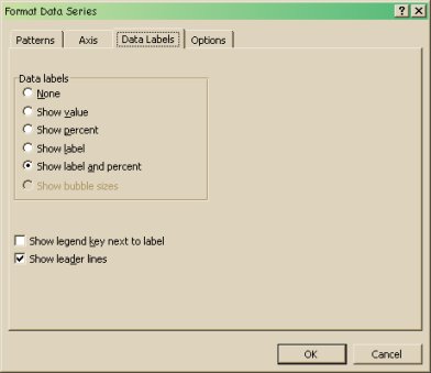
Figure 1
You’ll also want to control the font size of your labels. I’ve set all of mine to 8 points to better fit the available space. Just click on one of the default labels on your chart and set the size, color, and so on as desired.
For my client, the goal was simple: Each pie had a summary query that output two fields for the graph’s RowSource. The first field was a grouping field, and the second an aggregate value for each group. For example, using data from Northwind, I can compute the proportion of the number of sales for a given year by Employee, and display the results in a pie chart using the underlying totals query. Having just two fields of output is always the simplest method of working with MS Graph, as this statement does:
SELECT [FirstName] & " " & [LastNAme] AS Employee,

Count(Orders.OrderID) AS CountOfOrderID

FROM Employees INNER JOIN Orders

ON Employees.EmployeeID = Orders.EmployeeID

WHERE (((Orders.OrderDate)

Between #1/1/2005# And #12/31/2005#))

GROUP BY [FirstName] & " " & [LastNAme];
Running the query provides the data shown in Table 1.
Table 1. Initial data results, with low variation.
| Employee | CountOfOrderID |
| Andrew Fuller | 41 |
| Anne Dodsworth | 19 |
| Janet Leverling | 71 |
| Laura Callahan | 54 |
| Margaret Peacock | 81 |
| Michael Suyama | 33 |
| Nancy Davolio | 55 |
| Robert King | 36 |
| Steven Buchanan | 18 |
The results of this particular example work well when displayed in a pie chart. The somewhat random assignment of Orders in Northwind makes the display easily readable. As you can see in Figure 2, leader lines clarify the problem when the labels begin to crowd each other in rptSalesPieChartLowVariability. And, regardless of whether this chart is viewed by a color-sighted customer or printed here in gray scale, the proportion of each slice is easily attributed to the corresponding Employee.

Figure 2
Unfortunately, the data behind a display may not always be so conducive to pie charting. This is particularly true where the range of values varies widely, as it did for my client. I’ve manipulated the Northwind data to have both very high and very low values, as shown in Table 2.
Table 2. Data results with high variation (low of 2, high of 39).
| Employee | SumOfCountOfOrderID |
| Andrew Fuller | 15 |
| Anne Dodsworth | 2 |
| Janet Leverling | 2 |
| Laura Callahan | 22 |
| Margaret Peacock | 39 |
| Michael Suyama | 32 |
| Nancy Davolio | 35 |
| Robert King | 2 |
| Steven Buchanan | 3 |
Report rptVariableSalesPieChartAsIs, which uses this dataset, clearly shows the display problems encountered with this highly variable data (see Figure 3).
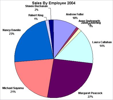
Figure 3
Data labels and leader lines alone can’t resolve the display of the “just a thin slice for me” pieces of the pie. My client’s pies suffered from this same general problem, and I needed to chart an answer.
No pie for me, thanks…
My first reaction to this challenge was “yeeech.” I really don’t enjoy working with Microsoft Graph. I’m somewhat familiar with programming its objects, but the version used in the Office suites constantly changes and I use Graph so infrequently that I have to re-familiarize myself with the object model each time. Somehow I needed to manipulate the label positions, preferably by using the Access tools that I was familiar with.
Label positioning is a difficult and imprecise “science.” Cartographers have been working on the problem for decades and have, in the past, employed supercomputers to solve optimum placement and overlap problems. I knew from this that the solution to the problem would be heuristic–that is, a solution that works most of the time by following a rule-based approach that increases the probability of a correct or acceptable outcome. While I couldn’t guarantee that every graph would turn out well, I could ensure that most graphs would look good most of the time.
After much consternation (which always seems to happen to me when working with Graph), I learned that the options for label positioning would not allow for x,y repositioning with any certain relationship to where the corresponding pie slice lay in the chart. Then it occurred to me: The real problem isn’t how Graph handles the labels, but in how Graph handles (or doesn’t handle) the order of the pie slices. In fact, Graph relies on the ordering of the underlying dataset to control the order of the pie slices. If the data is ordered by the aggregate value, then the small slices will always fall next to each other.
But I hadn’t ordered the data in rptVariableSalesPieChartAsIs. In fact, it happened that the lowest values fell at the beginning and end of my dataset. Trying to solve the problem by programming Graph label objects wasn’t the solution; controlling the order of the slices was.
VBA times pie equals…
My client’s report contained eight pie charts, each hosted in a subreport on its own page of the main report. I needed a general heuristic that maximized the spacing between the data labels by rearranging the pie slices. I decided that the best I could do was to alternate high and low values and let the chips (labels) fall as they may. Unfortunately, I couldn’t think of a SQL statement that would output my data in alternating high/low order. Then I remembered the feature of Access that makes it such a great product–Jet, a local data engine with the ability to manipulate data in local tables. All I had to do was load a table with the data in the optimum order and have the pie chart link use it as its RowSource.
My first step was to output the data into ascending and descending order using two aggregate queries. Table 3 shows the results of the first query, which sorted the results in ascending order; Table 4 shows the second query, sorting the data in descending order.
Table 3. Data sorted in ascending order.
| Employee | CountOfOrderID |
| Robert King | 2 |
| Janet Leverling | 2 |
| Anne Dodsworth | 2 |
| Steven Buchanan | 3 |
| Andrew Fuller | 15 |
| Laura Callahan | 22 |
| Michael Suyama | 32 |
| Nancy Davolio | 35 |
| Margaret Peacock | 39 |
Table 4. Data sorted in descending order.
| Employee | CountOfOrderID |
| Margaret Peacock | 39 |
| Nancy Davolio | 35 |
| Michael Suyama | 32 |
| Laura Callahan | 22 |
| Andrew Fuller | 15 |
| Steven Buchanan | 3 |
| Robert King | 2 |
| Janet Leverling | 2 |
| Anne Dodsworth | 2 |
With this information in hand, I could step through both sets and alternately place each row into a table until the number of rows added was equal to the number of rows in the original set. I created a procedure to perform this function named RecordsetValuesToTableAlternatingHighLow(). It accepts two SQL statements and the name of the output table. Here’s the opening of the routine:
Sub RecordsetValuesToTableAlternatingHighLow( _

SQL_ASC As String, SQL_DESC As String, _

strTable As String)

On Error GoTo ErrorHandler

Dim lngCnt As Long, RecsAdded As Long

Dim rstDESC As Recordset, rstTable As Recordset, _

rstASC As Recordset
My first step is to open a recordset on each of the SQL statements and on the table that will be the RowSource of my pie chart. I get the RecordCount from the first recordset to know how many records I’ll eventually need.
Set rstASC = CurrentDb.OpenRecordset( _

SQL_ASC, dbOpenDynaset)

Set rstDESC = CurrentDb.OpenRecordset( _

SQL_DESC, dbOpenDynaset)

Set rstTable = CurrentDb.OpenRecordset( _

strTable, dbOpenDynaset)

With rstASC

If Not .EOF Then

.MoveLast

lngCnt = .RecordCount

.MoveFirst

End If

End With
My next step is to append rows to my table, alternating between records from the ascending and descending sets. I use a simple RecordsetToTable() function (in the database accompanying this article) that iterates through the fields in my recordset and appends their values to correspondingly named fields in the output table.
Do While RecsAdded < lngCnt

'append lower value(s) to table

Call RecordsetToTable(rstASC, rstTable)

RecsAdded = RecsAdded + 1

If Not rstASC.EOF Then rstASC.MoveNext

If RecsAdded < lngCnt Then

'append higher value(s)

Call RecordsetToTable(rstDESC, rstTable)

RecsAdded = RecsAdded + 1

If Not rstDESC.EOF Then

rstDESC.MoveNext

End If

End If

Loop
Once RecsAdded equals lngCnt, all the aggregate values are in my table in alternating high/low order as shown in Table 5.
Table 5. High variation data in alternating rows.
| Employee | CountOfOrderID |
| Robert King | 2 |
| Margaret Peacock | 39 |
| Janet Leverling | 2 |
| Nancy Davolio | 35 |
| Anne Dodsworth | 2 |
| Michael Suyama | 32 |
| Steven Buchanan | 3 |
| Laura Callahan | 22 |
| Andrew Fuller | 15 |
Each time the report rptVariableSalesPieChartFormatted is opened, code in its OnOpen event empties zstblSalesByEmployee and sends the ascending and descending versions of the data to RecordsetValuesToTableAlternatingHighLow(), which reloads zstblSalesByEmployee with the alternating high/low values:
Private Sub Report_Open(Cancel As Integer)

Dim strSQL_DESC As String, strSQL_ASC As String

CurrentDb.Execute "DELETE FROM zstblSalesByEmployee"

strSQL_ASC = "SELECT [FirstName] & ' ' & _

[LastNAme] AS Employee,  " & _

"Count(Orders.OrderID) AS CountOfOrderID " & _

"FROM Employees INNER JOIN Orders " & _

" ON Employees.EmployeeID = Orders.EmployeeID " & _

" WHERE OrderDate Between #1/1/2004# And " & _

" #12/31/2004# " & _

"GROUP BY [FirstName] & ' ' & [LastNAme] " & _

"ORDER BY Count(Orders.OrderID) "

strSQL_DESC = strSQL_ASC & " DESC"

Call RecordsetValuesToTableAlternatingHighLow( _

strSQL_ASC, strSQL_DESC, "zstblSalesByEmployee")

End Sub
Now my pie displays all the data in an easily readable fashion without the need for a legend (see Figure 4).

Figure 4
Caveat emptor a la mode
Remember, this is a heuristic technique. It won’t always work. You can make our simple dataset cause labels to overlap by reassigning all but one of Andrew Fuller’s 2004 sales to Nancy Davolio, resulting in a very low number for Andrew Fuller occurring right next to Robert King’s slice. Or, imagine a dataset with close to 100 groupings. There’s no way the labels will fit. On the other hand, you probably shouldn’t be using a pie chart to display that many data points.
I’ve included all of my examples and code in the database accompanying this article. The Employees and Orders tables come loaded with our example data sets. You’ll also find examples in the database using this technique for other chart types. It works extremely well with 3-D pie charts and even somewhat with Doughnut charts. Hmm, doughnuts…
Sidebar: Data Labels
Providing data labels is simple, and enhances your displays for both color-sighted and colorblind viewers. In an Access report, double-click the pie chart to switch to the Microsoft Graph editor. Click on the pie itself and then the Properties button on the MS Graph toolbar. Microsoft Graph will open the Data Series formatting dialog. Select the Data Labels tab and choose the format you’d like the chart to display. In Figure 1, I’ve chosen to show both the grouping value and its percentage. I’ve turned on leader lines so that Graph can more easily space the labels and link them to their slices.
Other Pages You Might Like
Create Dynamic Chart Applications