Microsoft Access isn’t known as a tool for displaying spatial or mapping information. But, with a few special tricks, some crosstab queries, and MSGraph, you can transform coordinates into useful maps. Garry Robinson demonstrates techniques that can be used for statistics, graphs, and extending your crosstab queries, regardless of how you want to lay out your data.
After reading the title of this article, you might feel that the techniques it describes don’t apply to you. After all, you might say, your databases don’t contain any mapping information. I’d be willing to bet, though, that in your databases you do have information that’s located somewhere on the surface of the earth and can be analyzed in a spatial way.
Let me just give you a couple of examples. If your database has sales results from cities in the United States, you can allocate a coordinate for each of those cities and segment sales into North, South, East, and West zones. A spatial analysis like this might let you find that your sales are declining in the East and growing in the West. How about this: Do you store the names and addresses of your customers? If you can allocate a coordinate for each of those addresses, then you’ll be able to review your customers buying patterns by splitting them into a grid. Now you can find where your latest marketing campaign is working because you can analyze results in adjacent suburbs.
Reasons such as these are why mapping software is being pushed into the general computing arena. This article will outline some techniques you can use right now to start analyzing your data spatially. Along the way, we’ll also show you how to work with two of Access’s more complicated graphs (and provide you with some shortcuts), and give you a function for classifying numeric data.
Making a frequency diagram
The first step in displaying statistical information spatially is to realize the importance of frequency diagrams. It was only through working with frequency diagrams that I learned the techniques I now use for making spatial grids. Outside of spatial analysis, a frequency graph is generally a bar or line graph that shows the number of values that occur within a fixed interval. In spatial analysis, a frequency graph is used to report on all the data that’s in a specific area.
On one project that my company worked on, we needed to report on the percentages of iron ore available in different sections of an iron ore deposit. Initially, we just wanted show how many samples had 0 percent to 10 percent iron ore content, how many had 10 percent to 20 percent ore content, and so on. This would allow the client to determine whether there was sufficient ore to make it worthwhile to develop the site. The data in the table consisted of hundreds of samples from all over the deposit site, each with a location and the percentage of ore that the sample contained. Our first step was to divide all of these values up into the percentage categories (0 percent to 10 percent, 10 percent to 20 percent, and so on). I used the following function to redefine the data:
Function Histo_FX(num_val As Variant, _

Class As Double) As Double


Dim Calc_Val As Double

If IsNull(num_val) Then

Histo_FX = 0

Else

Histo_FX = ((Int((num_val) / Class)) * Class)

End If

End Function
Passed a data item and the size of a category, the Histo_FX returns a new value at the lower edge of the category that the data belongs in. For instance, in my previous function, all my bands (0 percent to 10 percent, 10 percent to 20 percent) were 10 percentage points wide. Passed the number 57.4, the Histo_FX function returns the number 50, since 50 is the lower boundary for the category that 57.4 falls in (50 percent to 60 percent).
The calculation in the routine that does the conversion first divides the value by the width of the band. The calculation then uses Access’s Int function to reduce the result to the nearest integer. Finally, the routine multiplies that result by the width of the band to get the desired answer. As an example, here are the steps that the value 57.4 with a band width of 10 would go through:
Int(57.4/10) * 10

Int(5.74) * 10

5 * 10

50
The following query shows how we use the function. The query retrieves the salinity field, which contains the percentage of iron ore in the sample, from the MapData table and uses the Histo_FX function to group the data into bands that are 10 units wide. The results of this “aggressive rounding” technique are shown in Table 1.
SELECT Histo_FX([salinity],10) AS ClassInterval

FROM MapData;
Table 1. Sample inputs and outputs from the Histo_FX function.
| Salinity | ClassInterval |
| 21.82 | 20 |
| 18.75 | 10 |
| 37.27 | 30 |
| 16.5 | 10 |
With the data converted to a standard set of numbers, a simple summary query can count the number of entries in each group. The following query, used as a data source, gave us the graph shown in Figure 1.
SELECT ClassInterval,

Count(ClassInterval) AS NumValues

FROM qryClassIntervals

GROUP BY ClassInterval;
This graph not only shows that most of the values are concentrated in the 10 and 20 percent bands, but the shape of the graph also indicates that the data has a lognormal distribution (that’s another story, strictly for those with statistically bent minds). Based on the results of our analysis, the client decided to go ahead and develop the deposit. The next step was to determine which parts of the deposit had the highest concentration of ore and should therefore be developed first.
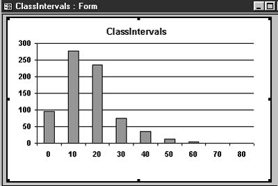
Figure 1
Allocating spatial information
Here’s the rule for working with spatial data: All spatial information can be consolidated by allocating X-Y coordinates to the grid cell in which the data exists. In other words, if you can assign a coordinate to a data item, then you can analyze it spatially. The coordinate has to place the data in two dimensions, the X and Y of a graph. Longitude and latitude provide a universal two-dimensional coordinate system that covers the whole world, but you’re not restricted to that. Any city map, for instance, will locate your addresses in a grid that you can use as your coordinate system.
The coordinates that came with our data were too specific, and so I needed to assign new coordinates so that samples that were in the same “area” shared the same coordinates. To assign coordinates, we applied our “aggressive rounding” process to the X-Y values in the Northing and Easting fields of my data set. The Northing field described how far North an item was (from whatever measuring point I chose) and the Easting described how far East the item was. The result was two new fields that placed samples in “areas” with other samples.
The following query reassigned the coordinates into a 100 * 100 grid:

SELECT East,

Histo_FX([Easting],100) AS EastGrid,

North, Histo_FX([Northing],100) AS NorthGrid

FROM MapData
This gave me the result shown in Table 2.
Table 2. Exact measurements converted to grid coordinates.
| East | EastGrid | North | NorthGrid |
| 481.14 | 400 | 182.6 | 100 |
| 522.39 | 500 | 168.45 | 100 |
| 563.64 | 500 | 154.3 | 100 |
| 661.51 | 600 | 225.75 | 200 |
| 620.26 | 600 | 239.9 | 200 |
| 579.01 | 500 | 254.05 | 200 |
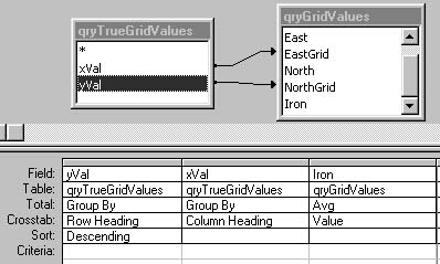
Using crosstab queries
The breakthrough I had with this technology was when I was demonstrating a system similar to this in a Lotus spreadsheet that I had painfully built by hand. The spreadsheet listed all of my Northings as column headings, and all my Eastings as rows. In each cell, I had the average of all of the data items for that area. When I saw the data in my spreadsheet, I immediately realized that I could do the same thing with an Access crosstab query that could be dynamically generated from my database. The crosstab query would generate a uniform grid, with the cells in the grid filled with the results of the average of all values that lie in that cell.
The following query does exactly that: It generates a grid of the average of all of the samples in a particular area and displays it with cell coordinates across the top and down the sides:
TRANSFORM Avg(Iron) AS AvgOfIron

SELECT NorthGrid

FROM qryGridValues

GROUP BY NorthGrid

ORDER BY NorthGrid DESC

PIVOT qryGridValues.EastGrid;
In Figure 2, you can see the resulting grid. Note that the display is already developing a spatial pattern that shows where the data occurs.

Figure 2
I’ve only used the Average function in my example, but a crosstab query is just a very fancy consolidation query. All the consolidation functions including Count, Sum, Avg, Max, Min, Standard Deviation, and Variance can be used in a crosstab query, making it very useful as a spatial analysis tool.
Solving crosstab problems
A crosstab query, like the one that I’ve demonstrated, won’t display a row or a column if no information exists for it. In other words, if there isn’t at least one data item recorded for a particular vertical or horizontal coordinate, the corresponding row or column won’t appear in the result. This isn’t something that you want in a spatial display where the physical layout of the gird must match the layout of the data “on the ground.” I fixed this problem by generating dummy cells prior to running my query by using SQL’s Cartesian product.
When you perform a multi-table query that doesn’t explicitly state a join condition among the tables, you create a Cartesian product. A Cartesian product consists of every possible combination of rows from all the tables involved. If you have 50 rows in one table and 10 in another, the Cartesian product that will result from joining those tables will be a table with 500 rows.
To make a query that returns every cell in a spatial grid, you must first create a complete grid. I did this by making tables with entries for every row and column. I have a subroutine that creates a table and then loads it with as many entries as I require:
Public Sub makeGrid_FX(tableName As String, _

cSize As Double, cMin As Double, cMax As Double)


Dim sqlStr As String

Dim valX As Double

Dim gridx As Double


On Error Resume Next

DoCmd.SetWarnings False


DoCmd.RunSQL "drop table " & tableName


On Error GoTo Err_MakeGrid

DoCmd.RunSQL "CREATE TABLE " & tableName & _

" (coord double);"


valX = cMin

Do While valX <= cMax

gridx = Histo_FX(valX, cSize)

DoCmd.RunSQL "Insert into " & tableName _

& " values (" & gridx & " )"

valX = valX + cSize

Loop


Exit_MakeGrid:

DoCmd.SetWarnings True

Exit Sub


End sub
Now if I want to make a square grid of 1,000 units with a cell size of 100 in both the X and Y directions, I call this routine to create a table of X axis entries, and a table of Y axis entries:
makeGrid_FX "xAxis", 100, 0, 1000

makeGrid_FX "yAxis", 100, 0, 1000

Now that I have two tables of 11 rows each, this SQL query creates a new table containing 121 (11 * 11) rows:

SELECT xAxis.coord AS xVal, yAxis.coord AS yVal

FROM xAxis, yAxis

ORDER BY xAxis.coord, yAxis.coord;
I now round off my query contortions by doing two outer joins to the original grid cells query in order to update my grid with the average iron values that I wish to display (see Figure 3 for the query).
Figure 3
Graphing the data
The final step is to graph the data. To get you into mapping, I’ll show you how to set up two graphs that can be used to display coordinate information. The chart I’ll use is a scatter (X/Y) plot like the one in Figure 4. Most developers find scatter charts hard to create because the queries you use for scatter plots are generally very different from the consolidation queries that you use in a normal graph.

Figure 4
Probably the easiest way to create a form displaying a scatter plot graph is to import the ScatterPlot form from the download database into your own database. Then all you have to do is convert the form’s data source to your own data.
Having said that, here are the steps to make a scatter (XY) graph from scratch:
- Open the database container and choose the Chart Wizard to create a new form.
- Select your table. Choose only two fields to act as coordinate fields for your graph.
- Choose the XY scatter plot as your required graph. Make sure that the two axes are selected for viewing on the scatter (XY) graph.
- Select the Sum consolidation option.
- Close the wizard to cause it to generate your form.
- Open the form in design mode.
- Find the Data Tab on the graph object and look at the data source. This will be a consolidation query that looks something like this:
SELECT East, Sum(North) AS SumOfNorth

FROM MapData

GROUP BY East
- Open the query in design mode and deselect the Totals button to make the query into a simple two-column query. The resulting SQL will look like this:
SELECT East, North FROM MapData;
- Return to your form and set the graph’s Enabled property to Yes and the Locked property to No. Changing these properties ensures that the graph will display your data instead of its sample data. You can reset these properties when you’ve completed testing (also remember to delete any test data from behind the form, as this is stored with the object and will increase the size of your form).
10.Now open the form and double-click on the graph to open it up. You’ll notice that you still don’t have a suitable scatter plot. To get a scatter diagram, select the Series in Columns option from the Data menu.
11.The last step is just for formatting purposes: Remove the lines between the points by right-clicking on a point and setting Lines to None on the Format Data Series tab.
The scatter diagram shows what grids on the map have data in them (you can see the heavy concentration from southeast corner of the grid and the sparser concentration in the north center section, for instance). What it doesn’t tell you is what the data in the grid is. You couldn’t tell that all the data items in the lower part of the grid are 10 percent deposits while the cluster in the upper part consists of 50 percent deposits. In Figure 5, you can see a graph that does show the values of the data.

Figure 5
Going from Figure 4 to Figure 5 might seem like quite a leap, but most of the difference is caused just by changing the graph type. The graph that I used in Figure 5 to display the true grid results is a little-used Access graph called a contour graph. These contours can be displayed in both two and three dimensions but actually work better using a conventional 2D view.
To display my query results I start with any form with a graph object in it (I’ve found that the graph wizard is useless in creating contour graphs). I change the graph type to one of the 2D surface plots, and then make the query behind the form use the results of the true grid query as follows:
SELECT xTabTrueGridResults.*

FROM xTabTrueGridResults;
To get the display that you see in Figure 5, I wanted the Y Axis series to display in reverse order. You can find this property by right-clicking on the Y Axis and choosing the Scale tab. Once again, you might find it just as easy to import the Contour plot from my sample database and use that one.
Going further
This approach to viewing spatial information became important in my work when I started applying all of the great filtering techniques that Access has to offer. I could easily control the data being displayed just by changing the clauses on my SQL statements to come up with a really flexible result. My partner on some of these projects was a senior geologist who was very good at statistics and really knew how to program a spreadsheet. Thanks to the flexibility of Office and Access, I could produce my grids and then copy them over to Excel, where he would compare results of different grids by stacking them on top of each other. His spreadsheet solutions were so complex that I could only marvel at the results that he came up with.
Computer-driven spatial analysis has been going on using mapping systems for nearly 20 years now. Efforts are under way by many software developers to make a mainstream mapping computing tool. Evidence of this can be seen with Microsoft Mapping, distributed with Excel, and MapInfo, bundled with the Crystal Reporting package (see the sidebar “Using MapInfo with Access”). Mapping applications are making inroads, making this another skill set that you might want to learn. In this article, I wanted to show you how to push the boundaries of Access as both an analysis tool, and as a way to see how your data relates to its location. The technology has certainly helped me in a number of important projects.
Other Pages On This Site You Might Like To Read
Programming Pivot Tables for Access Forms
How to Tame the Crosstab Missing Column Beast (and Get a Free Lunch)