
If you’ve surfed the Web, you’ve noticed rollover behavior—you slide your mouse over a control and it’s highlighted. You can do the same in your Access applications and even make it useful. Andrew Wrigley. shows you how.
Web applications use rollover behaviors. It would be nice to include such a feature in your Access forms, but there’s no built-in support for rollovers in VBA. So should you just roll over and forget it? The answer is definitely “No!” You can easily add such functionality yourself, as I’ll show you. However, the technique wouldn’t be interesting if it didn’t let you do something worthwhile. I’ll show you how to use the technique to give your Tab controls a customizable new interface and how to highlight a text box that has the focus, all for just a few lines of code per form.
The joys of constraints
I originally developed this technique to liven up my forms by giving hyperlinks rollover behaviors. What I needed was a simple way to give the controls on my forms High, Low, and Visited states—to mimic the rollover states of a hyperlink on a Web page.
With rollover behaviors, only one link can be highlighted at any one time, as the mouse can’t be over more than one control at once. The Access form hyperlink control lacks the MouseOver event that a Web hyperlink control has, so if you want to enforce the rule that just one hyperlink can ever be highlighted at any given time, you must treat the hyperlinks on your form as a group—highlighting one and “de-highlighting” the others. This is also the case for Tab control pages—you want only one tab to be selected at any one time. This constraint also applies if you want to highlight the text box on your form that currently has the focus, as only one text box on your form can have the focus at any one time.
The general solution is to handle the event that sets a control into its High state (the selected tab, the text box with the focus, and so on). You then leave that control in its High state until a different control in the same group is set into its High state. At that point, you set the old highlighted control to its Low state before setting the new current control into its High state.
Figure 1 shows my customized interface for a Tab control. To select a page, you click on the corresponding label on the left side of the form. That label is then set to its High state, and, in same run of code, the label corresponding to the previously selected page is set to its Low state.
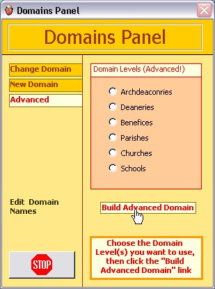
Figure 1
While this works for a Tab control interface, if you leave a hyperlink in its High state until another hyperlinks is highlighted, it won’t look like a rollover behavior at all. A hyperlink needs to go to its Visited or Low state after it’s been used. With my current design, if the user doesn’t move to another hyperlink, the original hyperlink will stay highlighted, regardless of where the mouse pointer is. The extension to my general solution to handle this is to use the form sections (Detail, Header, and Footer) as bogus “hyperlinks.” As the mouse rolls off the hyperlink onto the background of the form, code behind the MouseMove event of the form section sets the Hyperlink control back to its Low state. I use a name of “Background” for these bogus hyperlinks. A similar solution works for other scenarios where a control must be reset before another control is used.
There are still some outstanding design issues to be considered over and above the actual implementation itself: First, is it possible to create a generalized solution that doesn’t require writing special code for every implementation? Second, how can you stop the behaviors of one group of controls (the hyperlinks) from interfering with the unrelated behaviors of another group of controls (the new Tab controls)? Finally, how can you make the technique as resource-efficient as possible? The answer to these issues is to use custom classes and collections.
An AutoBehavior class
The implementation turned out to be very easy: Each group of behavior-related controls is represented by an instance of a custom class, called AutoBehavior. This object is stored in a private variable and declared in the declaration section of your form module. If you have another group of unrelated controls on the same form, you represent them with a different instance of the AutoBehavior class. In this way, the different behaviors are isolated from each other and can’t interfere with each other.
For instance, these three declarations would be all that’s required for a set of rollover hyperlinks, a set of tabs, and highlighted text boxes:
Private Rollover As AutoBehavior

Private TabButton As AutoBehavior

Private TextBoxBehavior As AutoBehavior
To get a control to participate in the rollover behavior, you just need to add this code to the MouseMove event of the control:
Rollover.Swap "hyperTest", AutoLink, nameFrm, nameParentFrm
Styles
One thing that makes formatting Web pages so easy is the use of Style Sheets. With this in mind, I’ve added a Style Sheet-like facility to this technique. This facility allows you to set the formatting of the High, Low, and Visited states of your controls in just one place. Figure 2 shows the object model for my classes.
Figure 2
My tool stores a representation of your control (what I call a “Control Image”). Each Control Image holds all of the information needed to set the different states of your control (High, Low, Visited, and so forth). These Control Images are custom objects, instantiated from a custom class called ControlImage.
The ControlImage object that holds the current state of a control’s appearance is stored inside the AutoBehavior class in a variable called Item. Also kept inside the AutoBehavior class is a collection of all the ControlImage objects that have already been used. This saves processor cycles, as the ControlImage object doesn’t have to be reinstantiated every time it’s required.
To show you how the ControlImage and AutoBehavior objects work, I’ll look at three scenarios: hyperlink rollovers, customized Tab control, and buttons or text boxes that highlight when they receive the focus. In this last case, I’ll go one step further to show you how to make the current text box zoom out to show the full text held in the field that it’s bound to.
Rollovers
After declaring the variables that I showed earlier, you’re ready to add behaviors to your form. If you’re using the technique with subforms, you’ll need matching instances of the AutoBehavior class for the subform as well as for the main form. Following the declarations of the AutoBehavior class, you’ll need these declarations in your form module:
Private nameFrm As String

Private nameParentFrm as String

You'll need this in your Form_Load event:

Private Sub Form_Load()

    SetBehaviors

    LoadInterface Me, nameFrm, nameParentFrm

 End Sub
The two variables, nameFrm and nameParentFrm, are set in the LoadInterface subroutine. These variables hold the name of the calling form (and subform, where applicable) and are passed to the AutoBehavior object’s Swap method. The nameParentFrm will only be set in subforms. You can view the code for the LoadInterface in the sample database in the Download file.
The SetBehaviors routine sets the AutoBehavior variables to new instances of the class:
Private Sub SetBehaviors()

    Set Rollover = New AutoBehavior

    Set TextBoxBehavior = New AutoBehavior

    Set TabButtonBehavior = New AutoBehavior

End Sub
The next step is to call the Swap method in the MouseMove event handler of the controls that you want to highlight. Each set of controls shares one of the AutoBehavior instances. For instance, all the Hyperlink controls would use the Rollover instance, as shown in this example:
Private Sub hyperTest_MouseMove _

    (Button As Integer, Shift As Integer, _

     X As Single, Y As Single)

    Rollover.Swap "hyperTest", AutoLink, _

       nameFrm, nameParentFrm

End Sub
The first parameter of the Swap method is the name of the control. The second parameter indicates what style you want to apply to the hyperlink. This parameter is a member of a custom enumeration type that I’ll describe later. You can customize the enumStyle enumeration to list the styles that you want to use (you can find it in the codeInterface code module). Here’s an example of the enumStyle from one of my applications:
Public Enum enumStyle

    MainLink = 0

    AutoLink = 1

    CrumbLink = 2

    PanelLink = 3

    PanelCmdLink = 4

    QuickLink = 5

    SupportLink = 6

    ZoomMemo = 7

    BoxText = 8

    TabLabel = 9

    BG = 1000

End Enum
This example defines 10 different styles for my interactive controls. Some are hyperlink styles (MainLink, PanelLink), some are text box styles (ZoomMemo and BoxText), and one is for Tab control interfaces (TabLabel). The BG “hyperlink type” has a value of 1000 to distinguish it unequivocally from the others. This style is just a placeholder, used for the bogus “Background” hyperlink that I mentioned earlier. In addition to adjusting the entries in the enum, you’ll have to update the styles associated with each setting.
My previous code showed what you need to put in the MouseMove method for a hyperlink. This is the code required in the MouseMove event of a form’s Detail section:
Private Sub Detail_MouseMove _

(Button As Integer, Shift As Integer, X As Single, _

           Y As Single)

    On Error GoTo Hell

Purgatory:

    Rollover.Swap "Background", BG, nameFrm, _

              nameParentFrm

Heaven:

    Exit Sub

Hell:

    SetBehaviors

    Resume Purgatory

End Sub
Here, when the Swap method is called, and no hyperlink was highlighted between mouse moves across the form, the Swap method detects that its first parameter is set to “Background” and returns immediately. SetBehaviors is called in the error handling section, so that if you want to stop the code when debugging your app, you can reinitialize your AutoBehavior objects after restarting just by rolling the mouse pointer over the background of the form.
If your hyperlinks are placed on top of other “background” controls (such as a rectangle) instead of directly on one of the form sections, you’ll need to put the same Rollover.Swap call in the MouseMove event of the underlying control (the rectangle).
That’s all that’s necessary to give your hyperlinks the rollover behavior that users have come to expect from surfing the Web. If you want to give the hyperlink a “visited link” formatting and colors, you just need to add the following code to the Click event handler of the hyperlink:
Private Sub hyperTest_Click()

    Rollover.Visited

    'any other code goes here…

End Sub
A customizable tab interface
In Figure 1 you can see a Tab control with three pages, where changing the selected page is controlled by clicking on the labels on the left-hand side. The label corresponding to the selected page is set to its High state by a call to the TabButton.Swap method. Since the labels on the left just need to indicate the selected tab, you don’t need to handle the MouseMove event of each label. Instead, you handle the OnClick event of the label, using the Swap method just as before. You’ll also need to set the style of the Tab control to None in its property sheet, so that it doesn’t display either tabs or buttons (you’ll handle switching between tab pages with the labels on the left).
The first step in implementing this interface is to put this code in your form’s Load event (this sets the initial page to display):
Private Sub Form_Load()

    SetBehaviors

    LoadInterface Me, nameFrm, nameParentFrm

    TabButton.Swap "lblChangeDomain", TabLink, _

                     nameFrm, nameParentFrm

    tabDomains.value = 1

End Sub
Next, you need to handle the OnClick events of the labels that correspond to each page of your Tab control. These three examples call the swap method and then set the Tab control to display the appropriate page:
Private Sub lblBuildDomain_Click()

     TabButton.Swap "lblBuildDomain", TabLink, _

        nameFrm, nameParentFrm

     tabDomains.value = 0

End Sub

Private Sub lblChangeDomain_Click()

     TabButton.Swap "lblChangeDomain", TabLink, _

        nameFrm, nameParentFrm

     tabDomains.value = 1

End Sub

Private Sub lblAdvanced_Click()

     TabButton.Swap "lblAdvanced", TabLink, _

        nameFrm, nameParentFrm

     tabDomains.value = 2

End Sub
One final example—in this case I use the on GotFocus event to highlight the text box that gets the focus:
Private Sub myTextBox_GotFocus()

    TextBoxBehavior.Swap "myTextBox", ZoomMemo, _

                      nameFrm, nameParentFrm

End Sub
As you can see, the only difference between the various scenarios is the event that you use to handle the highlighting of the control. In the text box sample, the text box has been given a style of ZoomMemo. This style is used to add an additional behavior to your text boxes: If they’re bound to a memo field, they’ll zoom out to display the full text string contained in the memo field, and then zoom in to their Low state size as the focus moves on.
The AutoBehavior class
Knowing how to use these classes may be sufficient for you. However, in this section I’ll take you inside the AutoBehavior and ControlImage classes that do the real work involved in controlling the formatting of the different controls in your behavior groups.
The Initialize event of the AutoBehavior class creates the collection (called col) that holds the ControlImage objects. The Terminate event destroys that collection:
Public Sub Class_Initialize()

    Set col = New Collection

End Sub

Public Sub Class_Terminate()

    Set col = Nothing

End Sub

The real work is done in the Swap method:

Public Sub Swap _

    (nameItem As String, typeItem As enumStyle, _

     nameFrm As String, _

     Optional nameParentForm As String)

On Error GoTo ErrorTrap

    Dim hn As String

    hn = Item.Name

    If hn = nameItem Then Exit Sub
At the start of the routine, I get the Name property of the ControlImage object presently stored in the Item variable. If it’s equal to the first parameter of the Swap method, nameItem, I exit the subroutine. This happens if the mouse is moving repeatedly over the same Hyperlink control. In that case, there’s no need for the formatting to change, so the Swap function doesn’t need to do anything.
The next lines of code set the ControlImage in the Item variable (the current ControlImage) to Low. This is where the swap in appearance happens. The Item variable is then set to ControlImage in the collection requested by the first parameter in the Swap method. Finally, this Item is set to its High setting:
    Item.Low

    Set Item = col(nameItem)

    Item.High

ExitOut:

    Exit Sub
But this is the simplest scenario—there are two errors that can occur. One is that the Item object is set to Nothing because this is the first time that the method has been called on this object. The second error is that no object is found col collection with the value of the nameItem parameter. The routine’s error handling deals with both of these scenarios:
ErrorTrap:

    Set Item = New ControlImage

    Item.SetItem nameItem, nameFrm, typeItem, _

               nameParentForm

    Item.High

    col.Add Item, nameItem

End Sub
In both cases, the Item variable is set to a new instance of the ControlImage class. Once this is done, the error handling code calls the SetItem method of the ControlImage class. I’ll look at SetItem later in this article. For now, assume that it sets up the ControlImage object correctly. Since the ControlItem object is set up correctly, I just set it to High and add it to the collection.
The only other method of the AutoBehavior class is the Visited method. This method is called from the Click event of a hyperlink to indicate that the Visited state of the control should be used instead of its Low state by calling the Clicked method of my ControlImage class:
Public Sub Visited()

    Item.Clicked

End Sub
The ControlImage class
At the top of the ControlImage class are the variables that control the current state of the class. These hold the name of the control, the value for the current style, the colors to be used by the different states of the control, the size of the control, a Boolean indicating whether the control has the Visited behavior, and (finally) a variable holding a reference to the control being managed:
Private hname As String

Private hstyle As enumStyle

Private hforelow As enumColor

Private hforehigh As enumColor

Private hbacklow As enumColor

Private hbackhigh As enumColor

Private hforevisited As enumColor

Private hbackvisited As enumColor

Private hborderhigh As enumColor

Private hborderlow As enumColor

Private hborderwidthhigh As Long

Private hborderwidthlow As Long

Private hheightlow As Long

Private hclicked As Boolean

Dim ctrl As Control
The hheightlow variable is used to hold the “Low” height of a text box. If you apply the ZoomMemo style to the text box, the text box will be expanded when it gets the focus to a new height. This new height is calculated using my GetMemoHighHeight() method. When the text box loses the focus, its size is reset to the height stored in the hheightlow variable.
The SetItem method is used to set the initial values for all of these variables:
Public Sub SetItem _

  (nameItem As String, nameFrm As String, _

   styleItem As enumStyle, _

   Optional nameParentFrm As String)

    hname = nameItem

    hstyle = styleItem

    If hname = "Background" Then Exit Sub
The only novelty is that the Sub will Exit if nameItem holds the value “Background”. This “Background” represents the bogus control for the background of the form and doesn’t need to set any variables to store formatting information. This block of code uses the nameFrm and nameParentFrm parameters to set the ctrl variable to the control being managed by the object:
Dim frm As Form

Set frm = GetForm(nameFrm, nameParentFrm)

Set ctrl = frm.Controls(hname)

Set frm = Nothing
The High and Low and Visited methods set the properties of the control to the values appropriate to the three states. I’ll just show the High method:
Public Sub High()

    If hname = "Background" Then Exit Sub

    With ctrl

        .ForeColor = hforehigh

        .BackColor = hbackhigh

        If hstyle = BoxText Or hstyle = ZoomMemo Then

            .BorderColor = hborderhigh

            .BorderWidth = hborderwidthhigh

            If hstyle = ZoomMemo Then

                hheightlow = .Height

                .Height = GetMemoHighHeight()

            End If

        End If

    End With

End Sub
The nested If statements allow extra formatting if the ControlImage object’s hstyle variable is set to BoxText or ZoomMemo (that is, if a text box is being highlighted). If the style is ZoomMemo, the GetMemoHighHeight() method calculates the size of the zoomed-out text box. The Low() method does much the same, with only one minor difference: It checks to see if the hclicked variable is set to True, in which case the control will be set to its Visited state rather than its Low state.
The GetMemoHighHeight() method does the absolute minimum in setting the height to display the full text stored in a Memo field. The routine retrieves the width of the control and the size of the font. It then looks through the text to see how many carriage returns there are and the total number of characters in the string and then calculates the size. The code checks to see that the result of the calculation isn’t smaller than the Low state height of the text box and, if so, sets the text box’s height to this value. (If anyone has a better way of performing this calculation, I’d love to see it.)
The StyleSheet method sets all of the formatting values for the style that you want to apply to your control states. The routine is a Select Case Statement based on the name of the style. This is the code for the PanelLink style:
Select Case hstyle

        Case PanelLink

            hforehigh = RedAccess

            hforelow = GreenDark

            hbackhigh = YellowPale

            hbacklow = OrangeLight

            hforeclicked = GreenDark

            hbackclicked = OrangeLight …
As shown here, instead of typing in the color values, I used another enumeration type (also in the CodeInterface code module) called enumColor. Here’s an example of that enum:
Public Enum enumColor

    GreyAccess = -2147483633

    RedAccess = 255

    BlueDark = 8388608

    GreyDark = 8421504

    YellowPale = 14811135

End Enum
This adds IntelliSense to your design and ensures a consistent color scheme throughout your app.
Using the code in your project
To use this technique, all you have to do is import the two custom class modules (AutoBehavior and ControlImage) and the one code module (codeInterface) into your project. You can find these in the sample database in the accompanying Download file. The code is entirely modularized, to make extensibility and customization as easy as possible. Ideally, if you want to modify the code you’ll only need to modify the two enumerations in the codeInterface code module (enumColor and enumStyle) and the StyleSheet Sub in the ControlImage object.
Web pages provide a far richer medium than Access forms when it comes to built-in interactive behaviors for the user interface. This technique redresses that issue and other shortcomings of the interfaces of Access controls, especially in the case of the Tab control. As custom classes have been used, the technique is eminently extensible and efficient both in programmer time and system resources.
