In this installment of his ongoing series, Dave looks at the part that reports play in developing your application. In addition to discussing the issues around development, this article looks at the most effective way to build your reports and some useful (though overlooked) properties.
In a series like this one, on application development, most people would expect the Data Modeling section to be followed by the Forms section. Once you’ve designed and built the database, the next step would be assumed: How do you get your information into your tables? Yet everyone who has worked with computer systems for some time is familiar with the phrase GIGO — Garbage In, Garbage Out. The value of the system is directly proportional to the accuracy of the data.
As a result, I’m taking a different tack here by concentrating on reports in this segment. Reports are a quick and easy way of verifying that your design is valid, because they determine whether you can get the data out in the order, format, and layout that you want. And you can do this before too much time and money have been invested in code. Getting sample data into the database can always be done with the Datasheet view in Access, so you can quickly and easily load sample data to work on your reports. Obviously, as the application matures, you’ll want to refine your reports, or create new ones, but doing some simple reports early on is a good test of a design.
Reports — detail vs. summary
Any experienced applications designer has been faced with the “shotgun blast” approach to reporting. This method basically says that if you report everything in detail, the users will be able to find the information they need within the report. The problem with this approach is that in a large application, it can lead to massive reports that make it impossible for the average person to find the relevant information they need.
I once worked on a system where the users insisted on getting (on a weekly basis, as I recall) reports that ran more than 1,000 pages (yes, 1,000!). These reports chewed up massive amounts of the system resources at night, not to mention slaughtering most of the northern forests. This led me to ask the key question, “What information are the users actually reading?” since I challenge anyone to review, even with a skimming glance, a report of that size. In reviewing the user requirements, it turned out that only two or three items were of key interest to the users. If those items didn’t look right, then the detail data was required to support the investigation into what was wrong. We agreed to supply the users with summary reports on a daily basis and detailed reports on demand. This decision let us save massive amounts of CPU cycles and hundreds of dollars on computer paper while still giving the users what they needed.
The key item here is the concept of working with your users. As a report designer, you need to ask questions that get to the heart of what your users need information for and how they’re going to use it. Be persistent with your questions. A request for all sales by division for the entire year for the entire country is a waste if the user really wants to verify the regional sales totals for the year. Ideally, this information will have been gathered during the requirements phase of the project, but don’t hesitate to go back to your users to refine the original request.
A good summary report will speak volumes, and it can be backed up by detail if it’s required. So what counts as a good summary report? That depends solely on the criteria mentioned previously — what information does the user want, and, more importantly, how is the user going to use the data?
Developing good reports — ask Mr. Wizard
Just like “real men don’t eat quiche,” you might feel that real programmers don’t use Wizards. My advice here is to forget the machismo and use the Wizards. Wizards aren’t perfect, and they probably won’t give you the report you require right off the bat. But they do give you a good framework to start with, and they save an awful lot of design time. Using a Wizard to produce a report is a good first step. The Wizard’s output will ultimately need to be refined, but it provides a nice, basic framework.
In my example application, for instance, I used the Report Wizard to create a simple employee listing (this was a good way to verify the data in the employee table). In Figure 1, you can see the design of the report that resulted from, basically, taking all of the defaults in the Wizard.
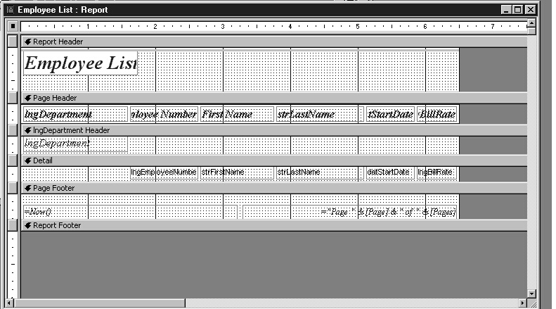
Figure 1
In this report, I asked for a simple listing, showing all of the fields in the employee table, grouped by department. As you can see, this is a good start to a basic list, but you need to look at the sample output in Figure 2 to see what the report will really tell your users.
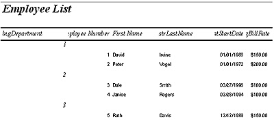
Figure 2
I’d be the first to admit that this report isn’t all that great. The point is that the report shows me some shortcomings in my database. To begin with, I haven’t taken advantage of Access’s ability to assign a caption to some of my fields, so my column headings reflect my field names instead of providing a more user-friendly title. Also, in this report, the department shows up only as a number.
To fix these problems, I went back and filled in the Caption property for my fields. Since I can base a report on a query as easily as a table, I created a query that joined the employee table to the department table on the department number. The report based on that query appears in Figure 3.
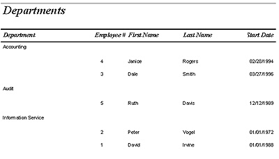
Figure 3
This report looks a little better, except I’m not happy with the sort sequence of the report. This sort can be overridden by using the Sorting and Grouping dialog box from the View menu in Report Design View. Remember that it’s these settings, and not the order of the query, that controls the sort order of the report (see Figure 4). In the Sorting and Grouping dialog box, I set the first line to sort by department number and the second line to sort by employee number in order to have the report sorted by employee within department.
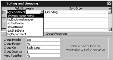
Figure 4
Refining the report
As I’ve mentioned, I consider the Wizard a great way to start report development, but in any report, you’re probably going to need to modify the report in Design View to get exactly what you want. After the Wizard has built the report and you’ve previewed it, it’s time to roll up your sleeves and get into Report Design View to customize.
In my Employee List report, the users wanted a total for the number of employees in each department. To do this, I added a group footer and used the =Count(fieldname) command to create a total. Adding the Group footer meant returning to the Sorting and Grouping dialog box, selecting the Department line, and then setting its Footer property to True. I then took a TextBox from the ToolBox, put it in the newDepartment Footer area on the report, and set its ControlSource to =Count(Empno). Figure 5 shows the resulting report.
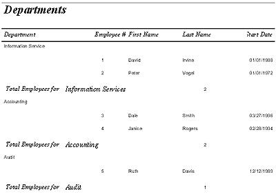
Figure 5
The result is a report that does a much better job of meeting the user’s requirements. I have the report with the data the user wants, the requested sort sequence, and totals and footer labels for each department. This is a much more presentable list. I can also convert this report from a detail to a summary report just by setting the Visible property of the Detail section to False.
Effective properties
One area that often gets overlooked by newcomers to Access is the power of the properties associated with a specific object. Properties not only control the look of an object but can control its behavior as well.
In the previously described report, I had set a group header and footer to allow me to put the department’s employee count in the footer. If the users hadn’t wanted the count, I wouldn’t have needed to add the grouping. If I remove the grouping, the report turns into the list that you see in Figure 6. You can see how the department name is repeated on each line, making it harder to find the start and end of each department. By setting the department TextBox’s Hide Duplicates property to Yes, I can avoid this duplication and get the same results as using the grouping (see Figure 7).
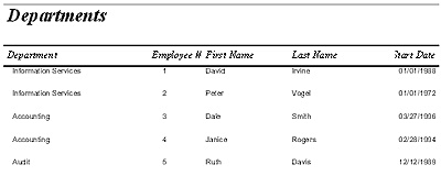
Figure 6
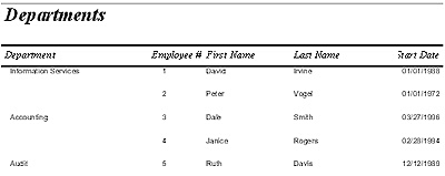
Figure 7
Don’t forget that properties exist not just for data objects, but for all objects. One common error that that newer users fall into is to set the Force New Page property on a group header to Break Before Section. This can lead to the Page Header being all alone on a page by itself as you get a page break before the first section prints. This problem can be eliminated by creating a group footer, right-clicking on the footer bar, selecting Properties, and setting the Force New Page property to Break After Section (see Figure 8). I sometimes find myself adding a group footer, not to display any data, but just to get the page breaks that I want.
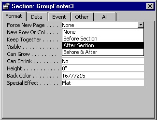
Figure 8
Finally, two overlooked properties are Can Shrink and Can Grow, which are associated both with TextBoxes and the Detail section. Setting a TextBox’s Can Grow property to Yes allows the TextBox to expand vertically if there’s a lot of data to display but shrink back to its original size if there isn’t. Allowing a TextBox to grow and shrink without also allowing the Detail section that it’s in to also expand is probably a mistake, so the section’s Can Grow property should also be set to True. Using these properties is more efficient than setting your TextBox and Detail sections to the largest size required by your data. This property can be set for both Reports and Forms, by the way.
That’s a quick introduction to Access reporting. In this installment, I’ve touched on what makes a good report and given you some tips for designing effective reports. The key to remember when creating reports is that you want to provide useful, timely information to your users. A report that isn’t read in its entirety is a waste of processing time and paper, so you want to design reports that directly meet your users’ needs. And, of course, by checking for Garbage Out early in your development process, you can prevent Garbage In later on.
Sidebar: A Complete Access Application
This series of articles explores the creation of a development time management database, which can be used for tracking software development. The system’s users can track program development, enter time spent on various tasks, record project “to do’s” and system modifications, and then, to top it all off, feed the project information into MS Project to keep that important project plan up to date. However, while the application is certainly interesting, the focus of each article will be on using the tools that come with Microsoft Access, including database design, security, replication, converting to Access 2000, and upsizing to SQL Server.
Sidebar: A Two-Pass Report Writer
by Peter Vogel
Normally Access makes only one pass through your report, formatting each section and then printing it. As Access lays out a section of your report, it fires the Format event for the section. You can place code, for instance, in the report’s Detail1_Format section to alter the contents of the Detail section before it’s printed.
However, if you use the report’s Pages property, Access turns into a “two-pass report writer.” The Pages property contains the total number of pages that will be in the printed report. In order to determine this number, Access must format the entire report to figure out the number of pages that will be in the report. As Access does this, it fires Format events for each section in the report. With the whole report formatted and a value for the Pages property calculated, Access returns to the start of the report and processes it as normal, firing a Format event followed by a Print event for each section.
Usually this process is only interesting if you add the Pages property to your report and it suddenly takes much longer to print the first page of your report. However, in the Access Compuserve forum, there’s a very neat report submitted by Donald E. Reid that uses this functionality to print a custom page number label on each page of the report.
In his report (which can be found in KOOLRP.ZIP in the Smart Access Bronze downloads), as Access makes its first pass through the report, Donald has code in a GroupHeader_Format event that stores what page the group header will print on. On the second pass through the report, Donald uses this information to print out on each page how many pages are used by the current group and what page number within that group is being printed.
For instance, the report begins by printing out four pages of sales to Argentina. The first page has a label that this page is “Page 1 of 4.” After four pages of information about Argentina (labeled “Page 2 of 4,” “Page 3 of 4,” and so on), the report moves on to print information about Brazil. The first page of this section is labeled “Page 1 of 3” and so forth, through all of the sections of the report.
By storing the start of each section during the first pass, Donald calculates the number of pages in a section by calculating the difference between the start page of the current section and the next section. Determining what page is currently being printed is simply a matter of subtracting the current page from the start page of the section. The system isn’t perfect, as Donald notes in his comments. If you open the report in Print Preview and page backward and forward in the report, the page numbering gets confused. However, if you just send the report to print, it works fine.
All in all, the report is a neat piece of coding that exploits a little-known feature of the Access report writer. The sample database that Donald has provided also includes a report that begins by printing a table of contents of the sections that it contains. I’ve been unable to contact Donald, but I’d like to thank him for sharing some neat code with the Access community.
Other Articles That Might Interest You